
Flow Builder and Flow Manager
Design the onboarding journey your clients complete. Chain blocks, configure steps, wire integrations, and publish a link that mints a fresh interaction for every visitor. You do not write code. You drag blocks, configure steps, wire integrations, and test on real devices.
Blocks · Steps · PublishingAbout this guide
This guide is written for the people who design, build, and operate flows on the Digital Experience Platform (DXP). The four areas covered are flow building, webhooks, data sources, and the settings that drive how flows behave. A flow is an end to end journey built in the Flow Builder. Each client submission that travels through a flow is called an interaction.
Signing in and moving around
- Open the DXP URL provided by your administrator.
- Enter your work email, then press Sign In.
- Enter your password, then press Login.
- If two factor authentication is on, enter the 6 digit code from your authenticator app.
You can sign in only with a work email that ends in your tenant domain. Once signed in, the left side menu shows Dashboard, Documents, Flow Builder, Flow Manager, Developers, and Settings. As a flow designer you mostly use Flow Builder, Flow Manager, and Documents.
The three blocks
Every flow is built from three block types. You can chain them as many times as the journey needs.
| Block | Facing | Purpose |
|---|---|---|
| Engagement Block | Client facing | Holds capture, signing, questionnaire, address, document upload, chatbot, and slot booking steps. |
| Connector Block | Bridge | Wires actions between client facing work and operations: Entity Management Engine, Interaction Status Change Notification, Create or Update Client, and Web Hook. |
| Backend Block | Operations | Holds the Application Processing Command Center where your team reviews and decisions interactions. |
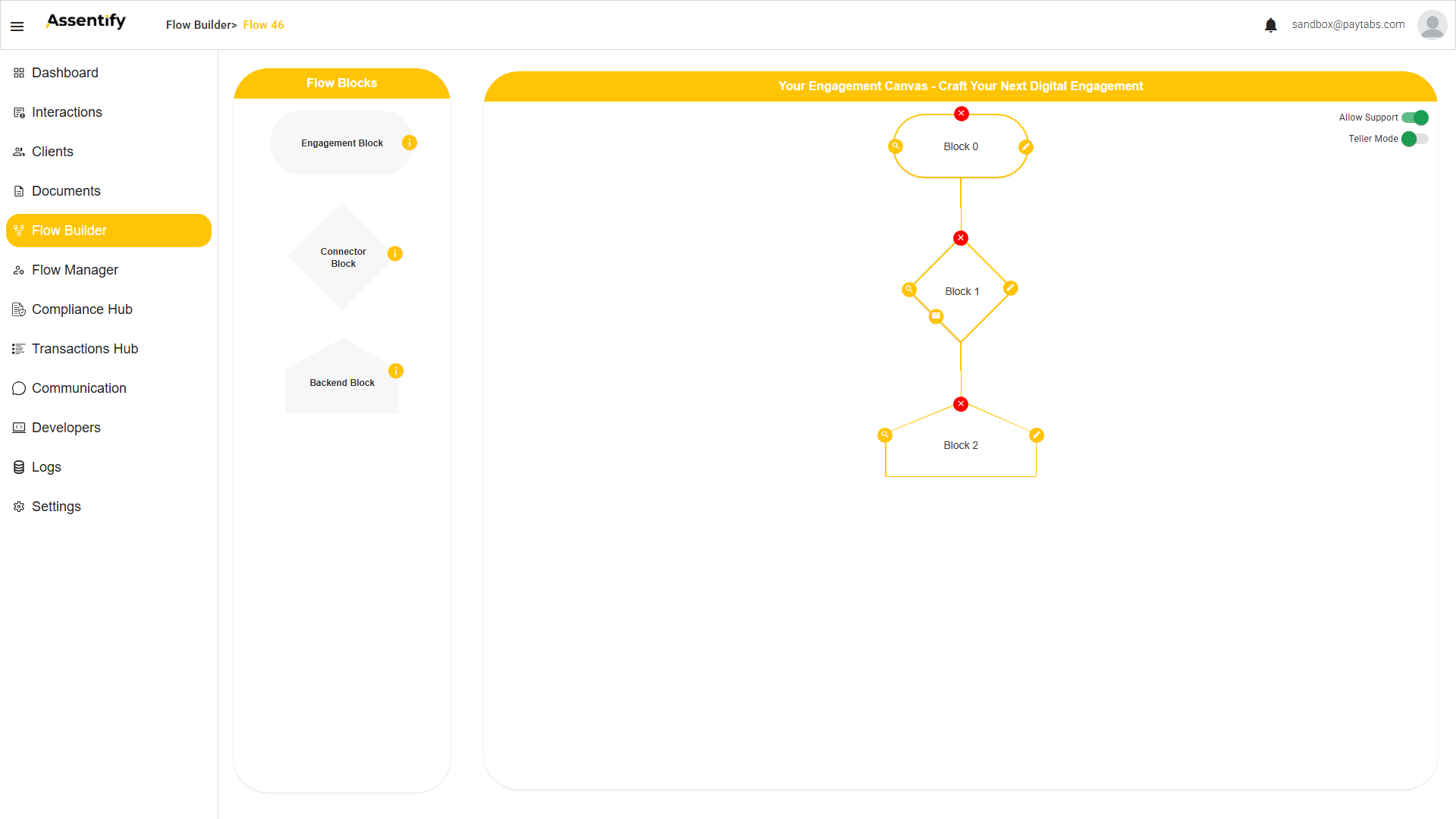
Each block on hover shows four controls: the red X deletes it, the magnifying glass opens its data viewer, the pencil edits its steps, and the green plus adds the next block.
The canvas draws each block as a distinct shape so you can read the chain at a glance. An Engagement Block renders as a rounded pill, a Connector Block as a diamond, and a Backend Block as a pentagon. The green plus sets each new block's type automatically by sequence: Engagement first, then Connector, then Backend, then Connector, then Backend, alternating. So you click the plus once per block and never pick a type yourself. Double-click any block to open a Block Name input and rename it. Two canvas toggles sit at the top right: Allow Support (on by default), which lets support agents assist during the engagement, and Teller Mode (off by default), covered under Branch Assisted Mode.
Engagement Block steps
Inside an Engagement Block you build a sequence that starts with Block Loader and ends with Wrap Up. The green plus between steps opens the step picker. Every step shares Title, Subtitle, Next Button, Logo, and a Normal Click toggle.
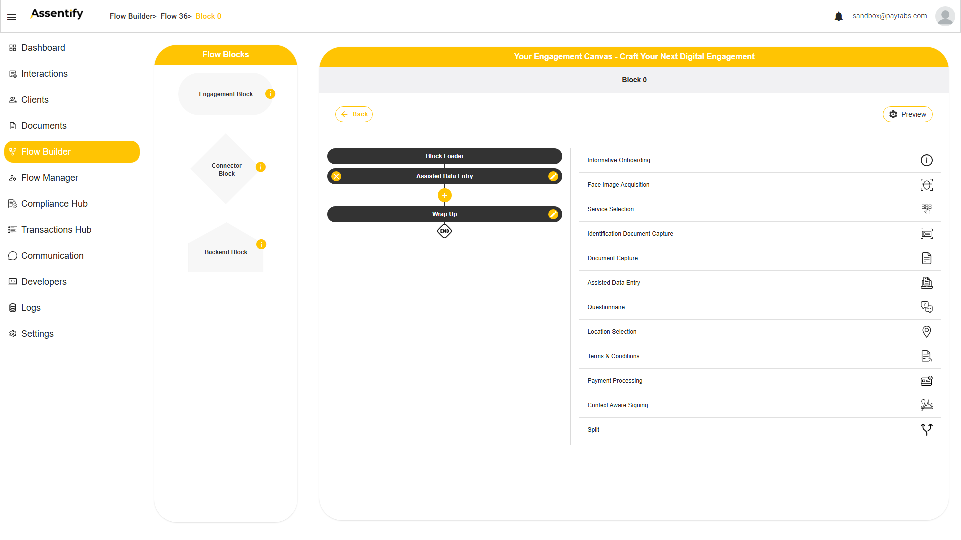
The names below are exactly as they appear in the step picker on the platform.
| Step (platform name) | What it does |
|---|---|
| Block Loader | Automatic first shell. Preloads assets for a smooth start. |
| Informative Onboarding | A multi-page welcome that sets expectations: time, documents, complexity. |
| Service Selection | Lets the client choose a service or path. |
| Split | Branches the flow on a selection or a data value. |
| Identification Document Capture | AI capture, OCR, MRZ extraction, and document liveness on an ID. |
| Face Image Acquisition | Selfie capture with AI face detection and liveness. |
| Assisted Data Entry | A form of sections and fields, pre-filled from earlier steps. |
| Questionnaire | Custom questions for KYC tiering or a risk profile. |
| Location Selection | Captures and validates an address or location. |
| Document Capture | The client uploads one or more supporting documents. |
| Terms & Conditions | Presents terms the client must accept, including GDPR consent. |
| Payment Processing | Takes a payment through a configured provider. |
| Context Aware Signing | Issues a generated document for digital signature. |
| Data Relay | Maps and relays captured data points between steps and to your connected systems. |
| Wrap Up | Automatic final shell. The thank-you message before submit. |
Every step in detail
Every Engagement Block step shares five base controls: Title, Subtitle, Next Button text, a Logo upload, and a Normal Click toggle. The type-specific settings for each step are listed below, using the exact platform names. After you set them, change the defaults to real values so Save turns on.
Informative Onboarding
A multi-page welcome that sets expectations before capture begins.
| Control | What it does |
|---|---|
| Insert Page | Adds a page. Each page has a Header, a Main Message, and an illustration upload. |
Service Selection
Lets the client choose a service or path, which a later Split step can branch on.
| Control | What it does |
|---|---|
| Source Type | Static (you list the services here) or Data Source (pulled live from a configured Data Source). |
| Next Button Title | The label on the continue button. |
Identification Document Capture
Captures an ID with AI auto-capture, then reads it with OCR and MRZ. This is the richest capture step, so its full control set is below.
| Control | What it does |
|---|---|
| Skip Ability | The client can skip this step. Useful while you test; turn it off before you go live. |
| Allow Passport | Allows a passport. Turning it on auto-enables Process Mrz. |
| Process Mrz | Reads the passport Machine Readable Zone. Auto-enables when Allow Passport is turned on. |
| Allow ID Card | Allows a national ID card. |
| Allow Other | Allows other accepted document types. |
| Country, Document Type | The country and document selection the client will see. |
| Front Only | Skips the back of the card. |
| Allow Mobile Based Capture | Lets the client switch to a phone for capture. |
| Set Mobile Capture as Default | Skips desktop and goes straight to phone. |
| Mobile Only Scanning | Blocks desktop capture entirely. |
| Show Result Page | Shows the extracted fields back to the client to confirm. |
| Store Captured Document | Keeps the document in the Documents store. |
| Is Manual Capture | The client takes the picture themselves, with no auto capture. |
| Document Liveness | Anti-spoof check on the document. |
| Disable Data Extraction | Turns off OCR and MRZ for this step. |
Face Image Acquisition
Captures a selfie with AI face detection and liveness, then enrolls, matches, or authenticates it.
| Control | What it does |
|---|---|
| Accuracy | A Low to High slider for how strict the face match must be. |
| Skip Ability | The client can skip the selfie. Turn it off before you go live. |
| Perform Liveness Detection | Proves a real person is present, not a photo. |
| Store Image Stream | Keeps the capture stream for review. |
| Show Captured Image | Shows the client the selfie that was taken. |
| Allow Image Retake | Lets the client take the selfie again. |
| Enroll, Match, Authenticate | Whether this capture enrolls a new face, matches it to the ID, or authenticates a returning client. |
Assisted Data Entry
A form built from sections and fields. Fields pre-fill from the OCR and MRZ of the ID step, so the client mostly confirms rather than types.
| Control | What it does |
|---|---|
| Add new section / Clone section | Groups fields into sections. Each section carries the five base controls plus Can Be Duplicated. |
| Data Entry Elements (+) | After you save a section, a plus adds fields. Each field picks an Input Type. |
The fourteen input types are: Text, Text Area, Date, Drop Down, Email, Radio Button Group, Checkbox, Checkbox Group, Nationality, Phone Number With OTP, Email With OTP, Phone Number, Upload Document, and Informative Display. Choice types (Drop Down, Radio Button Group, Checkbox Group) take an option list; the OTP types verify the email or phone inline; Nationality is a country picker; Informative Display shows read-only text.
Each field has its own settings. Beyond the input type, every field carries the controls below. This is where a form becomes smart: fields pre-fill from earlier steps, validate the entry, and normalize scripts and languages.
| Field setting | What it does |
|---|---|
| Mandatory | The client must fill this field before they can continue. |
| Hidden | The field exists but is not shown. Useful for a value carried silently from an earlier step. |
| Placeholder | The hint text shown inside the empty field. |
| Default Value | A value the field starts with. |
| Apply Regex | Validates the entry against a regular expression pattern, for example a passport or IBAN format. |
| Mapping Key | Maps this field to a data point captured by an earlier step, so it pre-fills. For example, map to the name read from the ID. This is the OCR or MRZ auto-fill. |
| Apply Transliteration | Converts the entry between writing systems, for example Arabic to Latin script. |
| Apply Translation | Translates the entry into the target language. |
| Additional Features | Expands to set Min and Max, the shortest and longest value the field accepts. |
Questionnaire
Asks a set of questions to tier KYC or build a risk profile.
| Control | What it does |
|---|---|
| Questions | Each question carries its own set of answer options. |
| Next Button | The label to continue once answered. |
Location Selection
Captures and validates an address or location.
| Control | What it does |
|---|---|
| Extract From Google Maps | Validates and completes the address from Google Maps. |
| Building/Floor | Collects building and floor detail. |
| Additional Info | A free text field for extra address notes. |
Document Capture
Collects one or more supporting documents from the client.
| Control | What it does |
|---|---|
| Allow Mobile Based Capture Linking | Lets the client hand off to a phone to capture. |
| Add new item | Add one item per document you want to collect. |
Terms & Conditions
Presents terms the client must accept, including GDPR consent.
| Control | What it does |
|---|---|
| Confirmation Required | The client must tick to accept before they can proceed. |
Payment Processing
Takes a payment as part of the flow.
| Control | What it does |
|---|---|
| Payment Provider | Cyber Source or Areeba. |
| Source of Payment Data | Data Source or Data Point. |
| Payment Data Type | Total or Itemized. |
| Value of Currency | The amount and currency to charge. |
| Tokenize Card | Stores a reusable card token instead of the card number. |
Context Aware Signing
Issues a generated document for the client to sign in real time.
| Control | What it does |
|---|---|
| Select templates | Picks a template from the Documents module, for example corporate.docx, individual.docx, or pp.docx. |
| Signing toggles | Enable Digital Signature, Auto Download, Enable Voice Consent, Enable Video On Signature, Enable Signature Visual Verifier, Show Signed Document, Enable Initials Tab, Requires Additional Data, Enable Document Review Metrics, Enable OTP, Skip Visual Signing, and Enable Context Aware Signature Features. |
Split
Branches the flow based on data captured by earlier steps.
| Control | What it does |
|---|---|
| Split Number | A slider from 2 to 5, the number of Sub Paths the split creates. |
| Sub Path | Each sub path has a Logic to activate sub path builder. Press the plus to add a condition on an upstream data point, then Save. |
| Default Path | The fallback taken when no sub-path logic matches. |
Connector Block steps
The Connector Block is the platform's data relay. After the client finishes the engagement, it screens and manages the entity, notifies on status change, creates or updates the client record, and pushes data to external systems. Open the connector with its pencil and add steps.
| Step | What it does |
|---|---|
| Entity Management Engine | Runs entity and AML processing on the captured data: screens the client against watchlists and manages the entity record. This lets screening start inside the Connector, before the Backend queue. See the Compliance guide. |
| Interaction Status Change Notification | Sends a notification (email) when the interaction status changes, using Settings > Email Setup. Templates can be static or dynamic. |
| Create / Update Client | Creates or updates the client record in the Clients section, mapping flow data points to client profile fields. |
| Web Hook | Calls an external URL with the interaction data. This push integration pairs with a Settings > Data Source of type Webhook. |
Sample: notify your core system when a client is created
A common pattern in the eKYC sample is to push the new client to your own systems the moment the record is created, so an ERP, a CRM, a core banking, or a core insurance system receives the data in real time. You do this by pairing Create / Update Client with a Webhook in the final Connector Block.
- In the final Connector Block, add a Create / Update Client step so the client record is written to the Clients section.
- Add a Webhook step after it. Point it at the Data Source for your core system, or configure it inline.
- Pick the endpoint (a Push Data Request), set the method and headers, and map the client data points into the body.
- Press Test on the Data Source endpoint to confirm the call reaches your system, then Save.
Backend Block, Application Command edit
In the Backend Block your team reviews collected interaction data and records a decision. Open the Application Command to configure the queue your team works from.
- Open the Flow Builder.
- Press the pencil on a Backend Block. The screen shows the steps list on the left, with Application Command by default, and the step palette on the right.
- Press the pencil on Application Command. The configuration opens with five collapsible sections.
| Section | What it configures |
|---|---|
| Title, Subtitle | The header on the queue. |
| Automated Processing | AML and PEP screening plus the Automated Decisions rule builder. |
| Pre-Processing | Extra fields the operator must fill: Input Text, Attach File, Select Value. |
| Decisions | Approve, Decline, plus any decisions you add. Each carries a name, a color, and the next route in the flow. |
| Configure Interactions table | The drag and drop column and bucket mapper for the queue view. |
Automated Decisions, the Automated Approvals rule builder
Expand Automated Processing. Below the AML and PEP screening toggles and the Filter by section sits Automated Decisions.
- Press the plus icon to add a rule.
- Set the Rule Name, a label for the audit trail.
- Set the Condition, the data point or screening signal to evaluate.
- Set the Decision to fire: Approve, Decline, or any custom decision you define, such as one that starts a supporting eKYC flow.
- Set the Check Value, the value to compare against.
- Press Save.
The system auto-decides the interaction the moment it arrives if it matches the rule. Operators only see interactions that do not match any auto-decide rule.
Never auto-decline
Use auto-decide only to fast track clean cases. Send everything else to a human. False positive auto-declines cost real clients. In AML context, treat a screening match as a review trigger, not a rejection.
The reason is cost: a false positive is a real client lost. A human reviewing a surfaced signal catches those false positives while still stopping true fraud, so you keep the safety value of the signal without the client-loss cost.
Building your first flow
A narrated walkthrough recorded from the real Flow Builder: rename the flow, add ID capture, face, assisted data entry, document capture, and signing, then chain a Connector and Backend and publish.
Start with a single Engagement Block, then add the client facing steps below in order. Turn Skip Ability on while you test and off in production.
| Step to include | Why |
|---|---|
| Informative Onboarding | Tell the client what to expect. Often skipped, but worth a screen. |
| Identification Document Capture | Turn Skip Ability on while you test, off in production. |
| Face Image Acquisition | With liveness. Skip Ability on while you test, off in production. |
| Assisted Data Entry | Pre-filled from the ID capture. |
| Questionnaire | Optional. For financial information, PEP, or tax residency questions. |
| Document Capture | Optional. For address verification or other proof. |
| Context Aware Signing | Summary document the client signs before submission. |
| Wrap Up | Thank you message and submission. |
- Drag an Engagement Block onto the canvas. A new flow is created and named automatically.
- Click the block's pencil to open its step sequence.
- Click the green plus above Wrap Up and choose a step type.
- Fill the step's fields with real values, then press Save.
Wiring the Connector and Backend blocks
After the Engagement Block finishes, chain the operations side. A common pattern runs a Customer Service Backend Block first, then a Compliance Backend Block.
- Add a Connector Block: set Status Change to Submitted, add a Notification email to the applicant, and an optional Webhook into your CRM.
- Add a Customer Service Backend Block: an Application Command with Automated Decisions for clean cases and a manual queue for the rest.
- Add a Compliance Backend Block: an Application Command with AML and PEP screening on, and inline review for matches.
- Add a Final Connector Block: Create or Update Client, send the approval email, and push to the core system over a webhook.
Flow Manager, publish and share
Flow Manager is the publish and distribution surface. The page title is Engagements, Administer Engagement. Tiles on the left show one per flow. The right panel holds the actions for the selected tile.
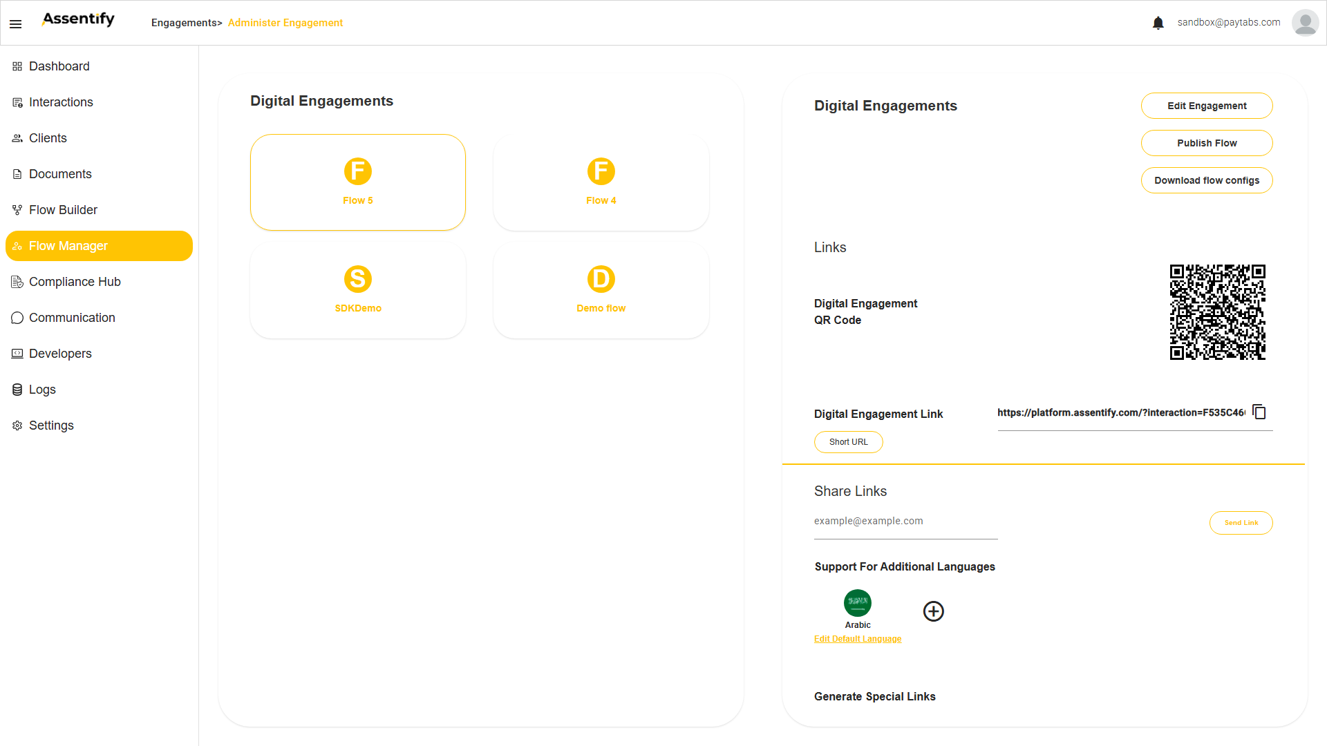
| Action | What it does |
|---|---|
| Edit Engagement | Jumps to the Flow Builder for this flow. |
| Publish Flow | Promotes the latest build to live. |
| Digital Engagement QR Code | A printable code that opens the flow on a phone. |
| Digital Engagement Link | The canonical URL, https://platform.assentify.com/?interaction=<hex>, with a copy button. |
| Short URL | A shortened version for social and SMS. |
| Share Links | Email the link directly to a person with Send Link. |
| Download flow configs | Exports the flow's configuration. |
| Generate Special Links | Creates purpose-specific links for the flow. |
| Support For Additional Languages | English plus Arabic, with a plus to add languages and Edit Default Language. |
| Clear Cache | Forces phones to fetch fresh assets after a change. |
Webhooks and Data Sources
Define data sources in Settings > Data Source. Cards on the page represent every source. A Data Source is a named connection the Webhook step can call.
- Press the plus icon and name the source.
- Pick the type: API or SOAP.
- If the source needs auth, choose API Key or Basic Auth.
- Fill in the URL and credentials. Press Test, then Save.
- Open the source and add endpoints: Pull Data Request, Push Data Request, or JSON File.
- Add headers, body, and XSLT if you need to transform inbound payloads.
Once a source exists, the Webhook step inside the Connector Block can call any of its endpoints. The Webhook can also be configured inline without going through the data sources screen.
Documents and Email Templates
The Document Template Builder is at Side menu > Documents. It turns a Word file into a template the Context Aware Signing step fills and signs.
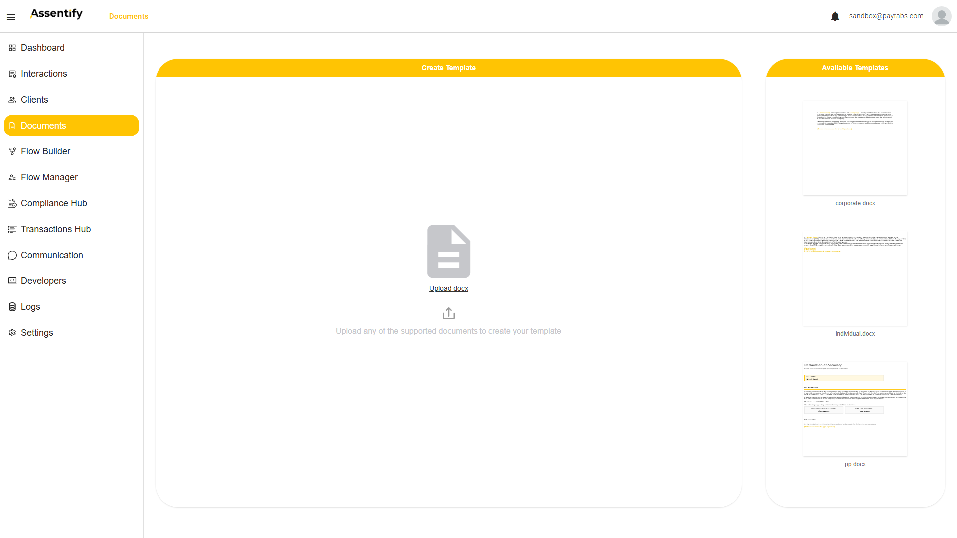
- Upload a .docx as a starter template.
- Right click in the builder to insert flow inputs (text, date, image, signature) as tokens wrapped in double brackets.
- Map each token in the Context Aware Signing step.
The Email Template Builder is reached from the Notification step in the Connector Block. Build the layout with blocks. Use Merge Tags to pull flow data points into the body. A token is a placeholder inside a document or email template, replaced by a data point at runtime.
Theme Builder, branding the flow
The Theme Builder is reachable from the profile menu, top right. It brands the client facing screens.
- Set the text color.
- Set the accent color and accent text color.
- Set the background body color and background card color.
- Upload the icon and primary logo.
- Pick the stepper style: None, Webview, or Circular.
Branch Assisted Mode (Teller Mode)
Branch Assisted Mode lets an agent, teller, relationship manager, or counter operator run a flow's Engagement Block on behalf of a client, from a branch. The client no longer has to complete it on their own device. You enable it per flow, then optimize how the block looks for the agent.
- Open the flow and turn on the Teller Mode toggle on the flow canvas.
- A new layout manager icon now appears on the Engagement Block. Open it to arrange and optimize how the block is presented to the agent for over-the-counter use.
- Arrange the layout in the layout manager, then save. Publish the flow.
- Agents run the flow for clients at the counter through the published flow's Digital Engagement Link, https://platform.assentify.com/?interaction=<hex>.
Roles and permissions
The DXP supports custom roles built from claims dragged into a role definition. The recommended starting roles for this audience are listed below. Your administrator can adjust the claims to match your operating model.
| Role | Recommended access | Typical tasks |
|---|---|---|
| Flow Designer | Flow Builder, Flow Manager, Documents, Theme Builder. | Build and edit flows, manage templates and theme. |
| Business Administrator | All Flow Designer rights, plus Data Source and most Settings. | Approve flow changes, manage integrations. |
| Solution Architect | All Business Administrator rights, plus Developers. | Wire SDKs, APIs, and end to end integrations. |
FAQ and troubleshooting
My change does not show up on the phone.
Press Clear Cache in Flow Manager. Assets are cached aggressively.
Can a Backend Block be shared between two flows?
Each Application Command belongs to one flow. Replicate the configuration across flows.
My webhook keeps failing.
Use Test on the Data Source endpoint to reproduce the call. The Logs section captures the response from the remote system.
Where do I turn off Skip Ability before going live?
Open each capture step in the Engagement Block and toggle Skip Ability off.
How do I add an auto-approve rule?
Open the Backend Block, pencil into Application Command, expand Automated Processing, scroll to Automated Decisions, and press the plus icon.